SIGNS, SIGNS, EVERYWHERE A SIGN: Signmaking, Vermont style. A magazine article from Our State Vermont featuring Design Signs.
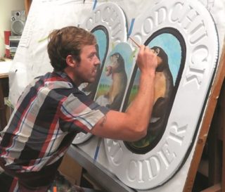
Our State of Vermont Magazine Article
Burlington Vermont’s Historic Signs / April 15, 2016
Here’s a great piece put together by Eva Solberger at Seven Days about Burlington Vermont’s Historic Signs. I love wandering cities and looking up at the old signs painted on walls. You can often see remnants of several layers of signs!
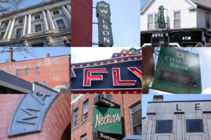
http://www.sevendaysvt.com/vermont/burlington-sign-tour-siv439/Content?oid=3292054
New blog for Direct Design / April 6, 2016
Check out the new blog from Chris Reck at Direct Design!
http://directdesigninc.com/brick-mortar-three-rules-design-branding/
Design Signs has been honored to work with Direct Design on branding for New England Federal Credit Union and other brand-conscious businesses. The photos in this blog post are some of our custom sign work for NEFCU. Nice blog, Chris!
Sign Painters Movie / March 25, 2016
Nice write-up in Seven Days about last night’s showing of the 2013 documentary “Sign Painters”. Mike Smith from East Dorset and I got to show some of our samples and photos, talk about sign design, Letterheads, etc. About 100 people came out for pizza, film and chat. Thanks to Lynda Reeves McIntyre from UVM for the invitation!
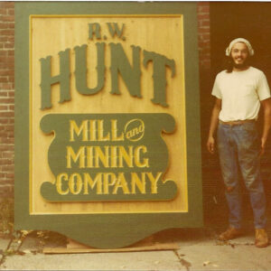
Click Here to read the Seven Days write-up!
The Most Underrated Museum That You Need To Visit / February 14, 2016
Thanks to Adventure Mom for this blog post about the American Sign Museum. Yes, that really is a thing! I’ve not been yet, but definitely will make the side trip on one of our drives to Chicago!
Check it out:
Click Here to see images of the museum!
What a year! / December 18, 2015
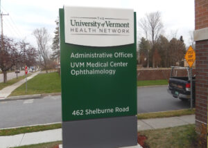
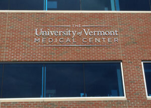
It’s been a crazy year! On top of all our usual work for hospitality, property management, higher-ed clients and others, we took on the installation of scores of signs for the conversion of Fletcher Allen Health Care to the University of Vermont Medical Center. From administrative offices to member hospitals and satellite clinics, we installed signs at 23 locations! This signage overhaul was labor intensive, and included lots of cut-out aluminum logos, some on brick walls 35 feet above the ground.
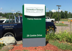
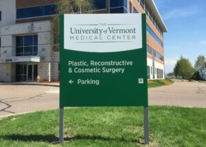
Our crew also installed twelve illuminated monument signs, each with reinforced concrete bases and a ton of post-and-panel signs directing patients to the offices.
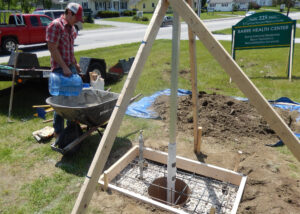
Although we can’t take any credit for them, it was clear that all these signs were very well made! Despite being weary (especially my fantastic installation team), I’m happy to have had the work and be a part of this project for UVM Medical. My team dug lots of holes and endured some late nights to be sure it all got done.
With God on our side…? / May 10, 2015
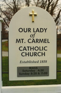
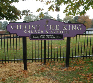
In our last blog post, I mentioned a time many years ago when we made signs for many churches in just a short time. Although I cannot find photos of all of those church signs, here are a few. If memory serves correctly, this was the sign that kicked off that run, Our Lady of Mt. Carmel in Charlotte.
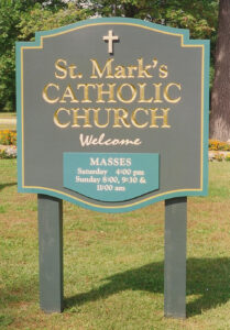
In that same era, we made identifying signs for two more Catholic churches in the area, St. Marks on North Ave. Burlington and St. Francis Xavier in Winooski; here’s the St. Mark’s sign:
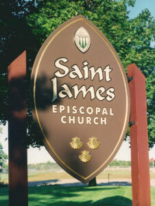
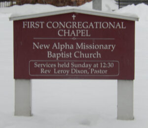
In the spirit of ecumenism, we also made signs for St. James Episcopal Church in Essex and New Alpha Missionary Baptist Church in Burlington!
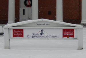
The New Alpha sign was a donation on our part to a fledgling church, founded by the Rev. Rodney Patterson. New Alpha still worships to this day in the chapel of my home church, First Congregational of Burlington. Here’s a much more recent update of the First Congregational sign:
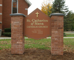
We continue to do work for area churches from time to time. Here are some from this century!
These signs are electrifying! / April 19, 2015
From time to time we receive requests for one type of sign or to serve one kind of client. For example, years ago we made signs for 10 churches in less than 6 months!
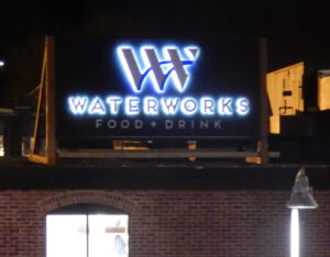
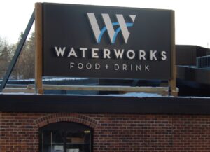
This past winter the trend was to electric signs. In January we created a sign for the much-anticipated reopening of Waterworks Restaurant in the historic Champlain Mill.
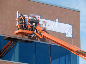
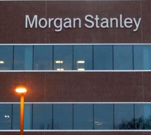
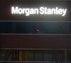
This was followed quickly by two signs on the beautiful new office building on Water Tower Hill in Colchester. Morgan Stanley’s sign had to go above their 6th floor windows. Due to topography on site, we had to use an 85 ft. boom lift to reach the location. Here’s our crack installation team on what may have been the only sunny day in January! They are applying the paper installation pattern that provides locations for each of the dozens of holes that must be drilled in the brick wall.
And here are day and night views of the finished product!
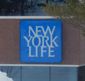
On that same building, we also installed a 7 ft. square logo for New York Life. This one did not need a lift for workers, but a crane to place the heavy sign on the wall.
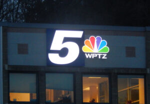
Soon after, we installed a new logo sign for WPTZ at their Colchester offices. It uses both an opaque aluminum box (with the “5” illuminated from within) and traditional illuminated channel letters.
All these signs use energy-saving LED illumination. Neon is outdated and expensive to run; it has never been in our portfolio of products we recommend to clients.
A recognition season / March 24, 2015
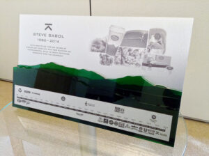
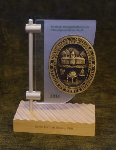
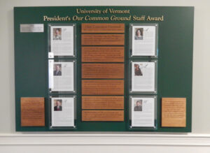
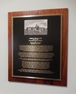
Creating displays to acknowledge the gifts from benefactors and recognize special individuals has been a sideline for many years. Within the last two years it has really taken off. Here are some samples of some of the latter from this winter.
Below is a retirement gift for a Keurig Green Mountain executive. About 24″ wide, with four layers of transparent acrylic mountains. The design is by Direct Design.
Here’s another brought to us by Direct Design. With a brushed aluminum mast and frosted acrylic “sail” mounted on a wood base with its own waves, this annual Distinguished Citizenship award also has a custom cast UVM bronze seal.
Continuing with work for UVM, this large display in Waterman building honors six staff members each year with the “Our Common Ground” award. With raised brush bronze letters in the heading and laser etched Vermont cherry plaques describing the UVM common values. 2015 winners are shown behind glass, and named on the cast stainless steel plaque upper left. there’s room for about 18 years of these stainless plaques.
And last, another plaque for UVM. This more traditional display honors Andrew Harris, the first black graduate of UVM. Cast bronze on cherry with small “glicee” photograph plaque.
Kitchen Table Bistro / Parkside Kitchen / January 13, 2015
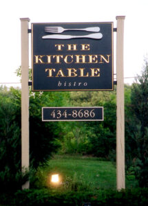
Twelve years ago Steve and Lara Atkins came to our Williston sign shop, telling me about their dream to open a restaurant. In the small town of Richmond, Vermont they were taking over a beautiful old brick house that had operated as the Chequered House Restaurant since the early 1980s. They were operating on a shoestring; in fact, they were living in a tiny apartment above the kitchen to save money. So we re-used the wood posts left from the Chequered House’s sign.
But they also knew the value of a sophisticated multi-dimensional sign. Their restaurant, Kitchen Table Bistro, was to provide a fine dining experience. To communicate that they asked us to create a high-end carved sign with 23 karat gold leaf in the letters. I suggested we make the knife and fork in their logo as complete three-dimensional sculpted pieces, just like the real thing but 4 feet long!
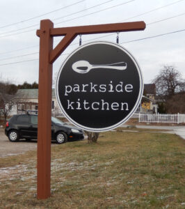
Now, after terrific success with many awards on the wall, they saw another opportunity in Richmond. When the beloved On The Rise Bakery closed, Steve and Lara decided to open a bakery and casual dining cafe in that space. And we are delighted that they asked us to make a sign for this new venture. Reflecting the lower prices at their new Parkside Kitchen, the sign we created has their logo in a simpler format. But we also wanted to give it some Vermont flavor, so we built a “post and beam” structure from which to hang the sign.
